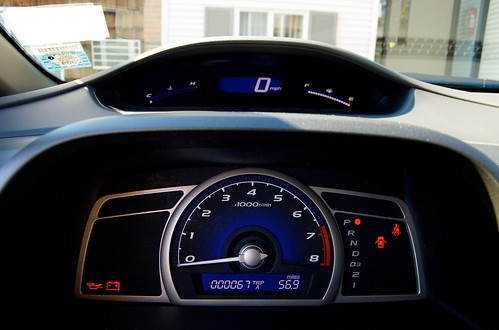
2009 Civic Review Part 1: The Dashboard
Because I don't have time to write one giant review I thought I'd divide it up into logical sections. Here's my review of the Civic dashboard.
First and foremost it's obvious that you're either going to love or hate it; there's no middle ground here. The two-tiered design is definitely not for everyone. Honda moved the important information (for an automatic car at least) to the top tier which is extremely visible while driving. The bottom tier holds less important information like your tachometer (which is much too large) and status lights. The (arguably) 3 most important pieces of information (engine temperature, speedometer, and fuel gauge) are front and center.
While driving you do not need to take your eyes off the road to check your speed. I found myself much more able to keep a steady pace in the Civic because I'm constantly aware of how fast I'm going. I suspect this might also make Civic owners less likely to speed.
For a whole week my main complaint about the dashboard was that it was way too bright at night. Thankfully last night I found that I had the brightness cranked all the way up. Dropping down just one level made a world of difference.
Personally, I love the dashboard. Don't judge it just from the photos though; you really need to experience it to decide if it's for you or not.
